Exploring Opioid Overdose Death Rate Trajectories in the United States
- Prepared by:
- Center for Translational Data Science (CTDS), University of Chicago
Attribution
In this notebook, we utilize data from the CDC WONDER database to demonstrate how data accessed through the HEAL Data Platform can be analyzed in a HEAL workspace, and to recreate images and figures as seen in the data brief by Hedegaard et al. titled Drug Overdose Deaths in the United States, 1999–2019 Hedegaard et al 2020
The purpose of this notebook is to demonstrate how the data may be accessed and used for analysis, and is intended to be used as a jumping off point for researchers who may wish to use these data for their own secondary analyses. While some of the analyses below may recreate analyses presented in the original publication, they are not intended to replicate the original results and differences in analytic methods and software, selection/filtering of observations, and handling of missing data may yield results that differ from the original.
The work here was conducted without direct involvement of the original authors and therefore does not necessarily reflect the views or opinions of the authors, of the NIH HEAL Initiative®, or of the Center for Translational Data Science (CTDS) at the University of Chicago.
Summary of findings
Prior widely circulated CDC analyses show synthetic opioids drive much of the increase in opioid overdose death rates in recent years (see Hedegaard et al 2020 and CDC presentations) using the CDC WONDER (Wide-ranging ONline Data for Epidemiologic Research) database.
However, synthetic opioids have considerable variance when looking at the state level of death rates. That is, distinct groups/clusters of states have high 2019 opioid overdose death rate, while others have considerably lower increases in death rates.
Mapping 2019 death rates show the high increasing group of states is quite restricted to the Northeast region of the US.
Future studies may want to hone in on the Northeast to understand social determinants and other factors (eg, clinics) related to high synthetic opioid death rates at a finer grained level, such as the county level. The HEAL platform makes such data, for example clinic locations in the Opioid Environmental Policy Scan repository, available, so that these analyses may be easier.
Load in necessary packages and define functions
!pip install seaborn kaleido==0.2.1 -q

import os
import shutil
from glob import glob
import re
import pandas as pd
import numpy as np
from sklearn.cluster import KMeans
import seaborn as sns

import matplotlib.pyplot as plt
import kaleido

from IPython.display import Markdown, Image, display
import plotly.express as px
def read_cdc_wonder_query(path):
df = pd.read_table(path)
no_notes = df.Notes.isna()
is_total = df.Notes=='Total'
return df.loc[(no_notes | is_total)]
def clean_column_names(df,replace_str='_'):
#clean column names
df.columns = [x.lower().replace(' ',replace_str) for x in df.columns]
def show_every_other_axis_label(fig,axis='x'):
if axis=='x':
tick_labels = fig.get_xticklabels()
else:
tick_labels = fig.get_yticklabels()
for ind, label in enumerate(tick_labels):
if ind % 2 == 0: # show every odd every odd year
label.set_visible(True)
else:
label.set_visible(False)
Pull file objects using the Gen3 SDK
!gen3 drs-pull object dg.H34L/5f8f3d67-15a5-4eff-834d-61ecea345588
!gen3 drs-pull object dg.H34L/ef07a234-5ab9-474b-8239-712fdf494164
!gen3 drs-pull object dg.H34L/f5cbd03a-217a-4786-80dd-2ca4fe3a6203
!gen3 drs-pull object dg.H34L/7dd7f3da-c905-4388-a051-c4802f7bbd1c
!gen3 drs-pull object dg.H34L/d0759aac-ea06-40ae-b3af-360ffe1823a0
{"succeeded": ["dg.H34L/5f8f3d67-15a5-4eff-834d-61ecea345588"], "failed": []}
{"succeeded": ["dg.H34L/ef07a234-5ab9-474b-8239-712fdf494164"], "failed": []}
{"succeeded": ["dg.H34L/f5cbd03a-217a-4786-80dd-2ca4fe3a6203"], "failed": []}
{"succeeded": ["dg.H34L/7dd7f3da-c905-4388-a051-c4802f7bbd1c"], "failed": []}
{"succeeded": ["dg.H34L/d0759aac-ea06-40ae-b3af-360ffe1823a0"], "failed": []}
Reproduce visualizations directly from Hedegaard et al., 2020 data brief
#read in cleaned data from HEAL platform
opioid_gender = pd.read_excel("deaths_gender.xlsx")
opioid_age = pd.read_excel("deaths_age_cat.xlsx")
opioid_type = pd.read_excel("deaths_type_opioid.xlsx")
Figure 1 : Gender
clean_column_names(opioid_gender,replace_str='')

fig, axes = plt.subplots(1, 1, figsize=(12, 6))

plt.plot(opioid_gender['year'], opioid_gender['deaths_total_per1k'], label='Total')
plt.plot(opioid_gender['year'], opioid_gender['deaths_male_per1k'], label='Male')
plt.plot(opioid_gender['year'], opioid_gender['deaths_female_per1k'], label='Female')

plt.ylabel("Deaths per 100,000 standard population")
plt.xlabel('Year')
plt.xticks(opioid_gender['year'])
plt.title("Figure 1. Age-adjusted drug overdose death rates, by sex: \n United States, 1999–2019")
plt.grid()
plt.legend()

plt.show()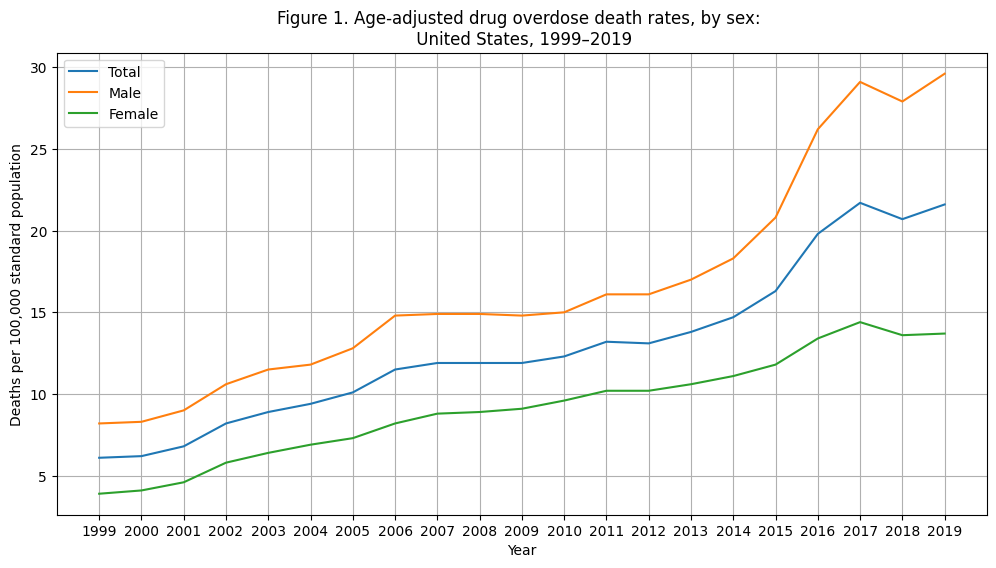
These data show both: (1) the rate of increase (driven by increase in more recent years); and (2) overall baseline deaths are higher for males than females. Note, these are adjusted for age related effects.
Figure 2: Age categories
fig, axes = plt.subplots(1, 1, figsize=(12, 6))

plt.plot(opioid_age['year'], opioid_age['age_15_24_per1k'], label='15 - 24')
plt.plot(opioid_age['year'], opioid_age['age_25_34_per1k'], label='25 - 34')
plt.plot(opioid_age['year'], opioid_age['age_35_44_per1k'], label='35 - 44')
plt.plot(opioid_age['year'], opioid_age['age_45_54_per1k'], label='45 - 54')
plt.plot(opioid_age['year'], opioid_age['age_55_64_per1k'], label='55 - 64')
plt.plot(opioid_age['year'], opioid_age['age_65_over_per1k'], label='65 and over')

plt.ylabel("Deaths per 100,000 standard population")
plt.xlabel('Year')
plt.xticks(opioid_gender['year'])
plt.title("Figure 2. Drug overdose death rates among those aged 15 and over, \n by selected age group: United States, 1999–2019")
plt.legend()
plt.grid()

plt.show()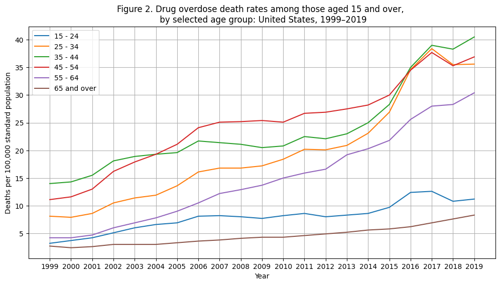
Clearly, the rate of change in recent years is driven by adults (25-54). Additionally, the young adults (25-34) showed a lower death rate in the early 2000s compared to the other adult groups. However, in more recent years, the 25-34 group has reached a similar death rate to middle aged adults.
This disturbing trend could be one avenue for exploratory analyses that data from the HEAL platform could help researchers address --- by providing a richer set of data.
Figure 3: Opioid Types
fig, axes = plt.subplots(1, 1, figsize=(12, 6))

plt.plot(opioid_type['year'], opioid_type['any_opioids_per1k'], label='All opioids')
plt.plot(opioid_type['year'], opioid_type['heroin_per1k'], label='Heroin')
plt.plot(opioid_type['year'], opioid_type['natural_semisynthetic_opioids_per1k'], label = 'Natural and semisynthetic opioids')
plt.plot(opioid_type['year'], opioid_type['methadone_per1k'], label= 'Methadone')
plt.plot(opioid_type['year'], opioid_type['other_than_methadone_per1k'], label='Synthetic opioids other than methadone')

plt.ylabel("Deaths per 100,000 standard population")
plt.xlabel('Year')
plt.xticks(opioid_type['year'])
plt.title("Figure 3. Age-adjusted rates of drug overdose deaths involving opioids \n by type of opioid: United States, 1999–2019")
plt.legend()
plt.grid()

plt.show()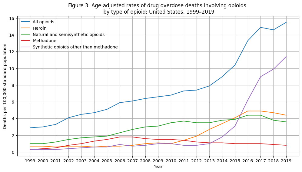
As we’ve seen in the previous two figures, overall opioid use has seen a dramatic increase in the 2010s.
While there are many types of opioids, one can clearly see that synthetic opioids other than methadone are driving this increase (drugs such as fentanyl, fentanyl analogs, and tramadol).
As we’ll see in the rest of the notebook, there are two open questions:
Is there substantial variance in this opioid group’s death rate?
Are there factors that can explain this variance providing actionable insights?
Deeper dive into the variance associated with opioid overdose increases directly from CDC Wonder data
By having more granular data readily available on the HEAL platform, you can explore the variance underlying the “cleaned up publication data” (also available on the HEAL platform).
Reproduce opioid type figure from publication using direct CDC Wonder data
total_df = read_cdc_wonder_query("cdc_wonder_year_cause_hedegaard_et_al_2020.txt")
clean_column_names(total_df)

type_column_labels = {
 'T40.1': 'Heroin',
 'T40.2': 'Natural and semisynthetic opioids',
 'T40.3': 'Methadone',
 'T40.4': 'Synthetic opioids other than methadone'
}


total_df['type'] = total_df['multiple_cause_of_death_code'].map(type_column_labels)
total_df['year'] = total_df['year'].fillna(0).astype(int).astype(str)

#create boolean vector for focus of subsequent analyses (for filtering)
is_opioid = total_df['multiple_cause_of_death_code'].isin(type_column_labels.keys())
is_synthetic_type = total_df['multiple_cause_of_death_code']=='T40.4'
#filter only synthetic opioids other than methadone
state_df = read_cdc_wonder_query("cdc_wonder_year_cause_state_hedegaard_et_al_2020.txt")
clean_column_names(state_df)
type_column_labels = {
'T40.1': 'Heroin',
'T40.2': 'Natural and semisynthetic opioids',
'T40.3': 'Methadone',
'T40.4': 'Synthetic opioids other than methadone'
}
state_df['type'] = state_df['multiple_cause_of_death_code'].map(type_column_labels)
state_df['year'] = state_df['year'].fillna(0).astype(int).astype(str)
#create boolean vector for focus of subsequent analyses (for filtering)
is_opioid = state_df['multiple_cause_of_death_code'].isin(type_column_labels.keys())
is_synthetic_type = state_df['multiple_cause_of_death_code']=='T40.4'
is_total = np.where(state_df.notes.isna(),False,True)
#make these objects given they are codes
state_df['state_code'] = state_df['state_code'].fillna(0).astype(int).astype(str)#convert metrics to numeric values and make a key for why missing
data = state_df
for metric_name in ['crude_rate','deaths','population','age_adjusted_rate']:
#get missing val strings
reasons_missing = ['Suppressed','Unreliable','Missing',None]
is_missing = data[metric_name].isin(reasons_missing)
#make a key showing to retain info on why missing
data[metric_name+'_missing_desc'] = data[metric_name]
data.loc[~is_missing,metric_name+'_missing_desc'] = np.nan
#missing for diff reasons but need to make float var from string -- if missing, make a NaN
data.loc[is_missing,metric_name] = np.nan #change missing val strings to NaNs
data[metric_name] = data[metric_name].astype(float) #change to var to float
del datafig, axes = plt.subplots(1, 1, figsize=(8, 4))
sns.lineplot(data=state_df, x="year", y='age_adjusted_rate', hue='type', linewidth=5, errorbar = ('ci', 95), err_style='band', ax=axes)
plt.ylabel("Deaths per 100,000 standard population")
plt.xlabel('Year')
plt.xticks(state_df['year'], rotation=45)
plt.title("Figure 5. Age-adjusted rates of drug overdose deaths involving opioids \n by type of opioid: United States, 1999–2019 \nwith 95% confidence intervals")
plt.legend()
plt.grid()
plt.show()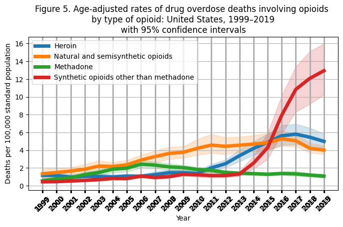
Conclusions from adding information about variance (ie, 95% confidence intervals) to the opioid type plot:
While there is a large increase in synthetic opioid (in red) use in recent years, there are also differences among individual states.
So, the question is: what are the individual death rate trajectories for individual states? Are there patterns/clusters amongst states that can inform how to target public policy/health interventions?
fig, axes = plt.subplots(1, 1, figsize=(8, 4))

sns.lineplot(data=state_df.loc[is_synthetic_type & ~is_total], x="year", y='age_adjusted_rate', hue='state', linewidth=1, errorbar = ('ci', 95), err_style='band', ax=axes)

plt.ylabel("Deaths per 100,000 standard population")
plt.xlabel('Year')
plt.xticks(state_df['year'], rotation=45)
plt.title("Figure 5. Death Rate By Year For Individual States")

plt.grid()
plt.legend([],[], frameon=False)

plt.show()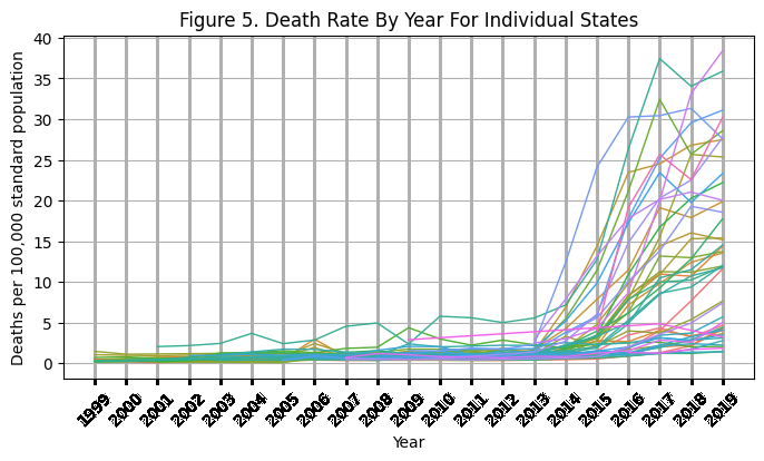
Clearly, by looking at individual state trajectories, we can see there are is a clear separation of states with small and large increases in reported opioid death rates.
With these drastic increases for some states, the rate of change appears to be highly correlated with the most recent reported death rates.
Therefore, in subsequent exploration, I compare death rates in 2019 amongst individual states (note another approach would be to look at model outputs using exponential growth functions in a hierarchical linear model format).
Investigate distribution of 2019 synthetic opioid overdoses across states
#2019,synthetic categorical bar plot organized from smallest to largest
is_2019 = state_df.year=='2019'
state_2019_synthetic_sorted_df = (
    state_df
    .loc[(is_2019 & is_synthetic_type & ~is_total)]
    .sort_values(by='age_adjusted_rate',ascending=False)
)

median_state_death_rate = state_2019_synthetic_sorted_df.age_adjusted_rate.median()
fig, axes = plt.subplots(1, 1, figsize=(8, 4))
plt.hist(state_2019_synthetic_sorted_df.age_adjusted_rate,bins=20, rwidth=0.8)#ax=axes)
plt.xlabel("Deaths per 100,000 standard population")
plt.title("Figure 6. Frequency of synthetic opioid (other than methadone)\nstate death rates for the year 2019")
plt.show()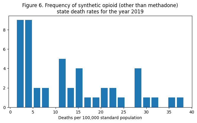
As can be seen from state trajectories, the distribution is heavily skewed towards small death rates.
The black line in the figure represents the 50% mark for death rates. This means that the majority of state death rates are under 11 deaths per 100k.It also appears that there may be several clusters of state death rates that will help us “categorize” state groupings.
Now the question is: what are these states? Are they clustered in one region? If so, we could allocate our resources (and future analyses) to understanding how to help these states or uncover underlying causes.
fig, axes = plt.subplots(1, 1, figsize=(8, 8))

sns.barplot(
    data=state_2019_synthetic_sorted_df,
    x='age_adjusted_rate',y='state', ax=axes
)

plt.xlabel("Deaths per 100,000 standard population")
plt.title(
    "Figure 7. Frequency of synthetic opioid (other than methadone) state death rates\n"+
    "ranked from largest to smallest death rates for the year 2019"
)

plt.show()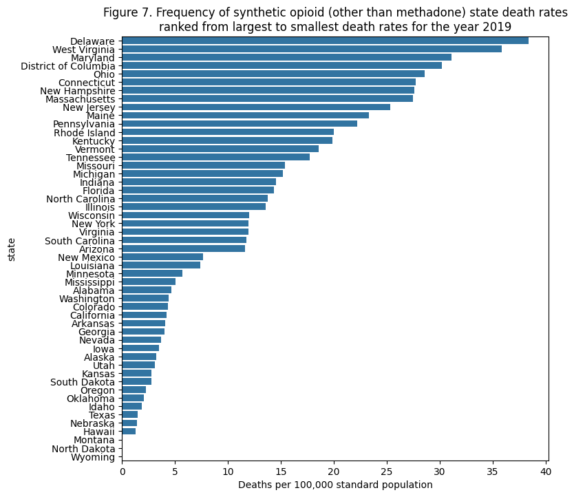
From the list of states ranked from highest to lowest death rates, one can see that they are clustered in the northeast/East Coast region.
Using KMeans clustering to group state death rates
kmeans = KMeans(3,random_state=100)

kmeans_groups = kmeans.fit_predict(
    (state_2019_synthetic_sorted_df
         [['age_adjusted_rate']]
         .fillna(median_state_death_rate)),

    ) + 1
state_2019_synthetic_sorted_df['kmeans_cluster'] = kmeans_groups

cluster_name_map = {
    3:'High',
    1:'Medium',
    2:'Low',
    -1:'Missing data'
}

#needed to impute missing values. Now I am going to add back in the missing values for viz
is_na_rate = state_2019_synthetic_sorted_df.age_adjusted_rate.isna()
state_2019_synthetic_sorted_df.loc[is_na_rate,'kmeans_cluster'] = -1

state_2019_synthetic_sorted_df['Death Rate Cluster'] = (
    state_2019_synthetic_sorted_df
    ['kmeans_cluster']
    .map(cluster_name_map)
)
fields = ['state', 'Death Rate Cluster']
display(Markdown(state_2019_synthetic_sorted_df[state_2019_synthetic_sorted_df['Death Rate Cluster'] == 'High'] \
[fields].reset_index(drop=True).T.to_markdown()))
display(Markdown(state_2019_synthetic_sorted_df[state_2019_synthetic_sorted_df['Death Rate Cluster'] == 'Medium'] \
[fields].reset_index(drop=True).T.to_markdown()))
display(Markdown(state_2019_synthetic_sorted_df[state_2019_synthetic_sorted_df['Death Rate Cluster'] == 'Low'] \
[fields].reset_index(drop=True).T.to_markdown()))
display(Markdown(state_2019_synthetic_sorted_df[state_2019_synthetic_sorted_df['Death Rate Cluster'] == 'Missing data'] \
[fields].reset_index(drop=True).T.to_markdown()))Just from looking at the data, we see our exploratory insights are now explicit.
That is, many of the same northeastern states we saw previously are now in the same cluster.